
Creating flexible and responsive designs has emerged as a key component of contemporary front-end development in the rapidly changing field of web development. When creating responsive websites, two effective CSS layout techniques – flexbox and CSS grid – are often used. While they both offer a lot of freedom in positioning and resizing on the page, their strengths lie in their own unique situations. To help you choose the best tool for your project, this article will examine the advantages and disadvantages of each (Flexbox vs. CSS Grid).
Understanding Flexbox
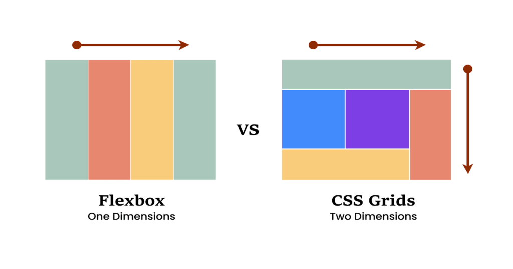
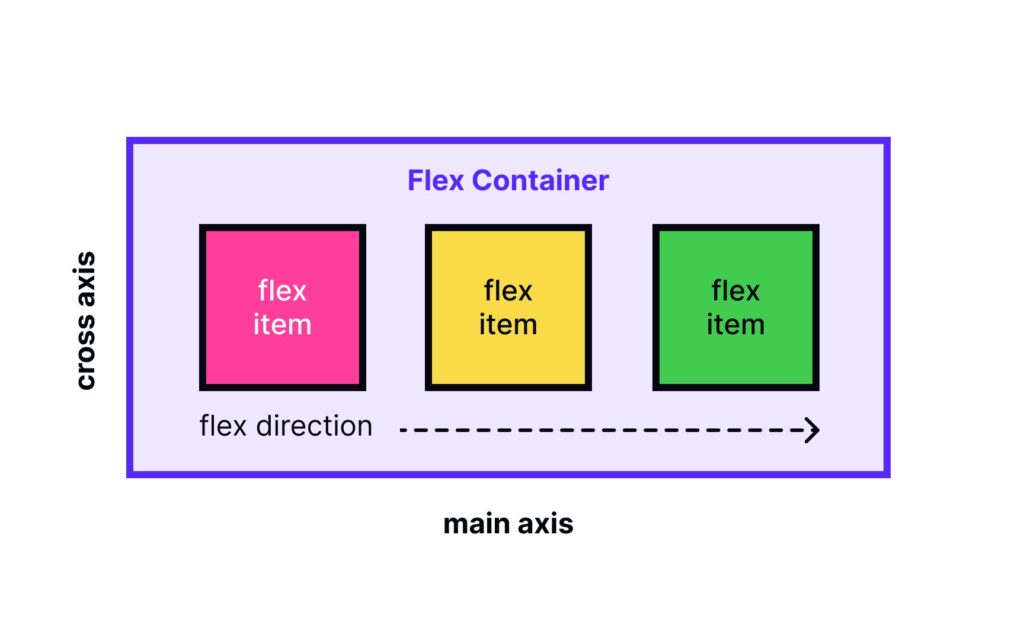
“Flexible box layout,” or “flexbox,” is a one-dimensional layout method used to arrange elements in a column or row. It’s ideal for dividing up space and aligning elements within a container.
Key Strengths:
- Simple and Intuitive: A major advantage of flexbox is that it’s easy to use and understand, making it perfect for beginners.
- Excellent for Basic Layouts: In situations like this, it excels at:
- Centering elements: Easily center elements vertically and horizontally.
- Distributing space between items: Easily set equal spacing between elements.
- Justifying content: Align items at the beginning, end, center, or with gaps between them to justify content.
- Responsive Adjustments: Features like
flex-grow,flex-shrink, andflex-basisallow flexbox to resize elements to fit the available space.
Limitations:
- One-Dimensional Focus: Flexbox can be used to create simple two-dimensional layouts, but it can be difficult when working with more complex grid systems.
- Limited Column/Row Control: Compared to CSS grids, it can be difficult to manage multiple columns or rows.
When to Use Flexbox
Flexbox is a great option because it
- Navigation Bars: To create menus vertically or horizontally.
- Small Layouts: Grouping buttons, cards, or form elements in a row or column is known as “small layout”.
- Simple Alignment Tasks: Centering objects within a container or allocating space between elements.
Understanding CSS Grid
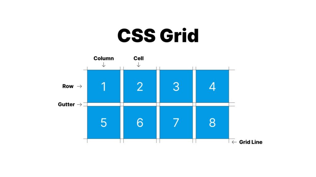
The two-dimensional layout method CSS Grid, on the other hand, is designed to create complex layouts in both rows and columns. It is more adaptable when working with designs that require precise control over the arrangement of elements.
Key Strengths:
- Powerful Two-Dimensional Control: Precisely define rows and columns with their size, alignment, and spacing is one of its key strengths.
- Complex Layouts Simplified: Easily create complex grid-based layouts, such as:
- Multi-column layouts: Create magazine-like layouts using several columns of different sizes.
- Nested grids: For highly structured content, create complex grids within grids.
- Flexible Positioning: Position elements anywhere within the grid using grid tracks and lines.
Limitations:
- Steeper Learning Curve: Since CSS Grid uses more complex terms and concepts than Flexbox, it has a slightly steeper learning curve.
- Browser Compatibility: Although polyfills are widely adopted, they may be necessary for older browsers to work properly.
When to Use CSS Grid
CSS Grid shines in scenarios like:
- Page Layouts: Organizing the general design of a web page, including footers, sidebars, and headers.
- Complex Components: Creating complex elements, such as gallery views or dashboards.
- Overlapping Elements: Allowing for imaginative designs for overlapping elements.
Flexbox vs. CSS Grid: Key Differences
| Feature | Flexbox | CSS Grid |
|---|---|---|
| Layout Dimension | One-dimensional (row or column) | Two-dimensional (rows and columns) |
| Alignment | Great for aligning items along one axis | Handles complex alignment across both axes |
| Item Placement | Sequential | Precise placement with grid lines |
| Complexity | Simpler for small tasks | Better for complex layouts |
| Responsiveness | Dynamic resizing based on space | Explicit track sizing and auto-placement |
Combining Flexbox and CSS Grid
It’s important to remember that flexbox and CSS grid can coexist. Often, you can successfully combine them to create hybrid layouts that capitalize on the advantages of both approaches. Flexbox can be used, for example, to organize items in a specific grid cell that has been set by CSS grid.
Choosing the Right Tool
Whether you choose Flexbox or CSS Grid will be greatly influenced by the specific needs of your project:
- Choose Flexbox when:
- When it comes to arranging items along a single axis.
- You need a one-dimensional, basic layout.
- Ease of use and a slow learning curve are your priorities.
- Choose CSS Grid when:
- You need to create complex layouts with multiple columns.
- You need precise control over where each element appears in a two-dimensional grid.
- You won’t mind a bit of a learning curve.
Conclusion
CSS Grid and Flexbox are both essential tools for web developers. Think of them as complimentary technologies rather than competing technologies. Use the power and precision of CSS Grid to create complex, two-dimensional layouts, and the ease of use of Flexbox and the functionality of aligning things along a single axis.
By understanding the benefits of each layout method and using them where they work best, you can create aesthetically pleasing and responsive designs that enhance the user experience. Have fun with your coding!